



















What does the landing page grader check?
The grader checks whether your page does the six jobs every conversion page has to do: say what it is, prove it, ask clearly, make the form easy, load fast and remove doubt. Each check is a yes or no question you answer by looking at your own page. Answer for the mobile version too, where most pages fail first.
It doesn't fetch your URL, run Lighthouse or read your analytics. Most of what decides conversion is copy and structure, which a crawler can't judge. For a deeper manual review, use our landing page audit checklist, which covers 40 conversion killers.
The 20 checks
- Message: The headline says what the product is and who it's for, in plain words. Why: a visitor who can't tell in five seconds whether they're in the right place leaves.
- Message: The subheadline explains how it works or the outcome it delivers. Why: the headline earns attention, and the subheadline does the explaining.
- Message: The page has one goal, and every section supports it. Why: competing goals split attention and weaken the main action.
- Message: The headline matches the ad, email or link that sent the visitor. Why: a promise the page doesn't repeat reads as bait.
- Message: The first screen shows the product or a real output, not abstract art. Why: showing beats claiming, especially for AI and technical products.
- Proof: Specific proof (named logos, a metric or a review score) appears within the first two scrolls. Why: proof next to the claim answers “says who?” when it's asked.
- Proof: Testimonials name a real person, role and company, and describe a concrete result. Why: anonymous praise reads as invented.
- Proof: A case study, demo or worked example shows the product solving a real problem. Why: detail is more credible than adjectives.
- CTA: The primary call to action is visible on the first screen on both desktop and mobile. Why: visitors ready to act shouldn't have to hunt.
- CTA: The button says what happens next, not “Submit” or “Get started”. Why: specific labels set expectations, and generic ones are the weakest performers.
- CTA: The primary action repeats after key sections, and secondary actions look visibly secondary. Why: one clear path beats several equal buttons.
- Form: The form asks only for what you need for the next step. Why: every extra field is another reason to stop.
- Form: Every field has a visible label, and error messages say how to fix the problem. Why: placeholder-only labels disappear as people type.
- Form: The page says what happens after submitting: who replies, how fast and what the call covers. Why: uncertainty is what makes people hesitate at the button.
- Speed: The page passes Core Web Vitals on mobile in real-user (field) data. Why: lab scores flatter, and field data is what visitors actually get.
- Speed: The headline and hero render without waiting for heavy video, sliders or scripts. Why: the first screen is the one that decides the bounce.
- Speed: Third-party scripts (chat, heatmaps, tags) have been audited, and only the needed ones load. Why: they are the usual cause of slow, laggy pages.
- Trust: Pricing, a starting price or a clear explanation of how pricing works is one click away. Why: hidden pricing makes serious buyers assume the worst.
- Trust: Privacy, security or compliance details relevant to your buyer are linked from the page. Why: B2B buyers check them before they hand over data.
- Trust: An FAQ answers the real objections: price, setup effort, switching and cancelling. Why: an unanswered doubt becomes a closed tab.
How should you read your score?
Score | What it usually means | What to do |
|---|---|---|
17–20 | The fundamentals are in place | Look at traffic quality and offer before redesigning |
12–16 | A few gaps are costing you conversions | Fix the missed checks in the order below |
7–11 | The page is unclear or unproven | Rewrite the message and proof before touching design |
0–6 | The page isn't doing its job yet | Start again from the copy, then design and build |
These bands are our working heuristic from reviewing startup pages, not an industry benchmark. Unbounce's benchmark report gives a 6.6% median conversion rate across industries and about 3.8% for SaaS, but published benchmarks conflict, so compare against your own past numbers first. Our conversion rate benchmarks explain how to pick the right comparison.
Hypothetical example: a seed-stage SaaS page scoring 11
For example, suppose a seed-stage analytics startup grades its demo page. It passes all three speed checks and the CTA checks, but its headline is a slogan, the hero shows an abstract gradient, the only proof is an unnamed quote, and pricing is hidden. That's 11 out of 20. The fix order: rewrite the headline and subheadline, swap the gradient for a product screenshot, add two named testimonials, then add a pricing explainer and an FAQ.
Which fixes should you make first?
Fix the message checks first, then proof, then CTA and form, then speed and trust. A clear headline on a slow page still converts some visitors, but a fast page nobody understands converts none. Most failed message checks are a copy problem, so start with how to write a landing page headline and the hero section guide.
- Message failed: rewrite the headline as what it is, for whom, and the outcome.
- Proof failed: move your best logos and one named testimonial into the first two scrolls. If you have no customers yet, use founder credentials, a demo and specifics instead.
- CTA failed: replace generic labels. In an Optimizely test, “Watch a Demo” converted at 1.59% against 0.91% for “Get Started”. See CTA button copy for alternatives.
- Form failed: cut fields to the minimum for the next step and add a line on what happens after submitting. Read landing page form design.
- Speed failed: remove scripts you don't use, compress the hero media and check field data, not just a lab score.
When should you get help with your landing page?
Get help when you've failed three or more message or proof checks, because those are copy and positioning problems that are hard to see from the inside. If the score is high but conversions are low, look at traffic and offer instead.
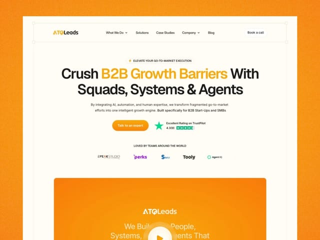
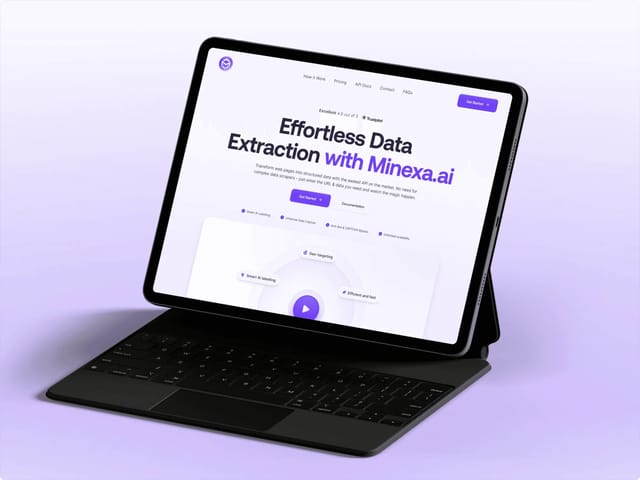
Our landing page package is $6,000, fixed: copy, custom design and an animated Next.js build, starting from the words. We've designed and built pages for teams like ATQ Leads and Minexa.ai. If you'd rather test us first, the $1,000 trial week is one week of design and development. The next step is a free 30-minute call, where we go through your score together. You can also check how AI answers see your site with the AEO score checker.